Overview
BEFORE
Sava came to us with a challenge familiar to a lot of financial brands: how do you make money management feel approachable without making it feel overly simplified? The product was modern and built for a new generation of investors, but it needed a visual identity that could make finance feel less intimidating while still earning trust.
AFTER
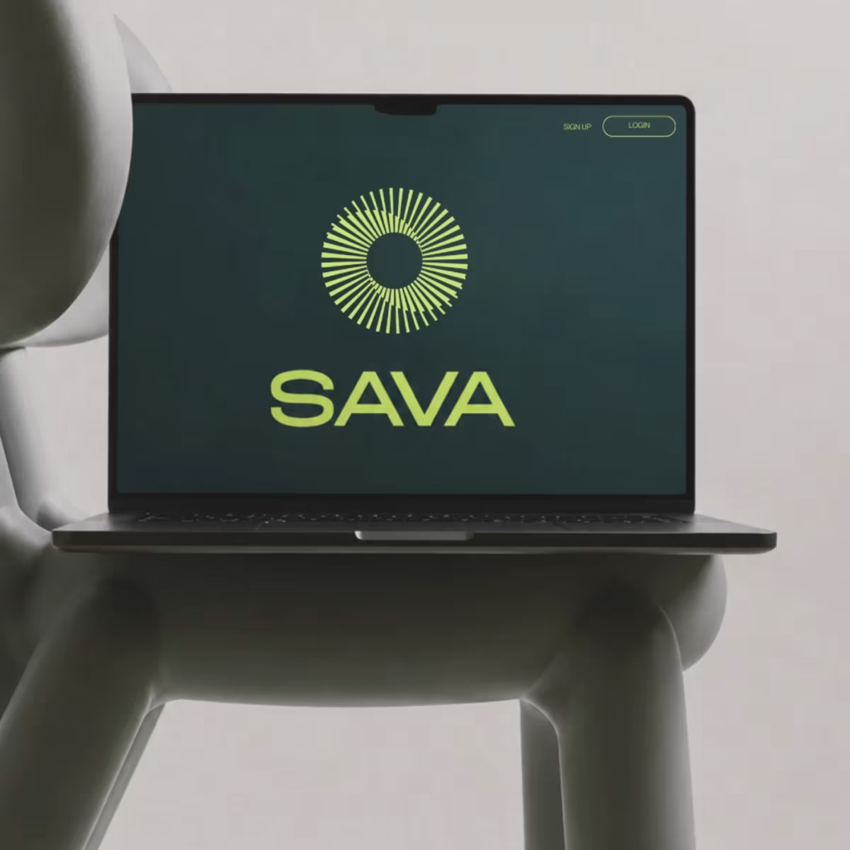
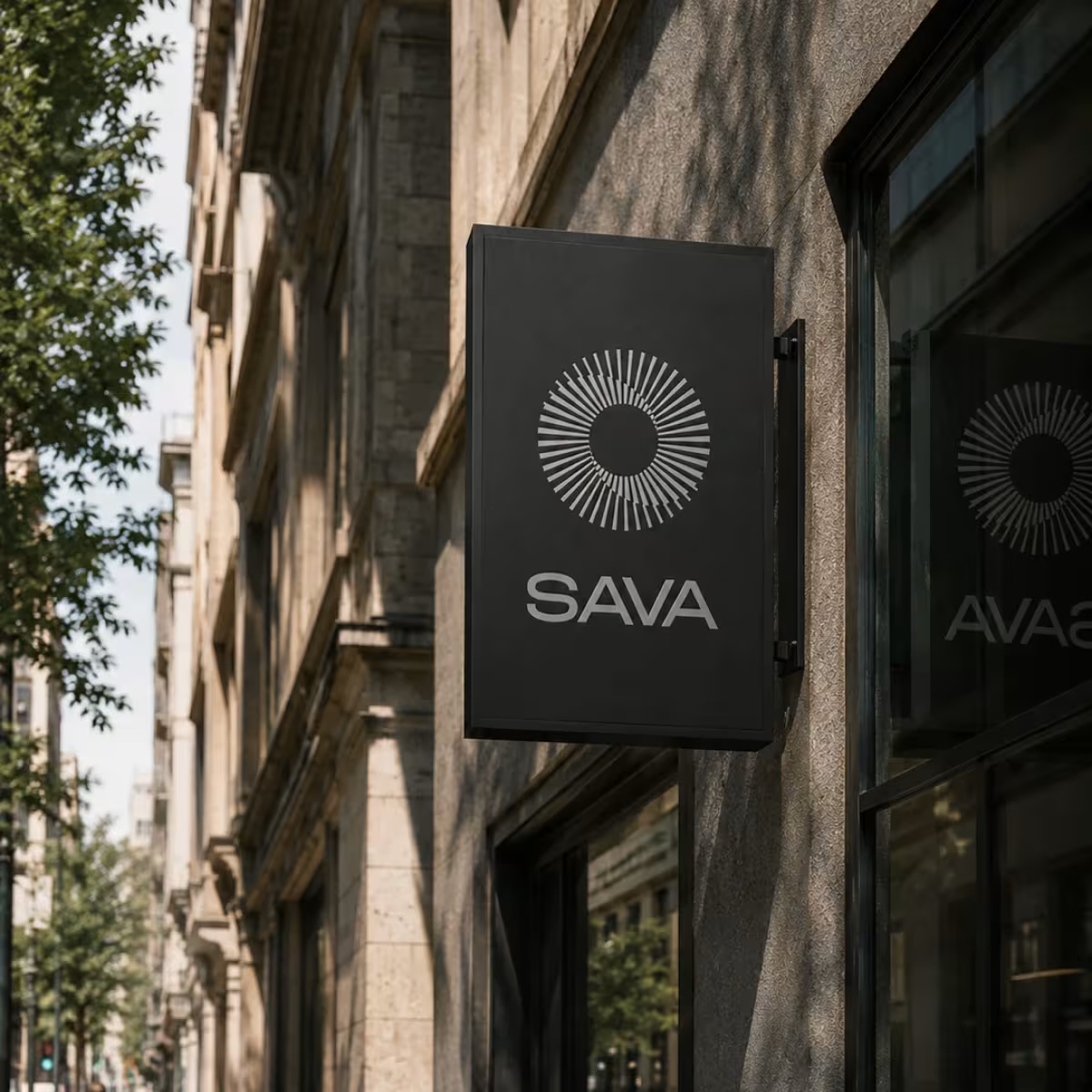
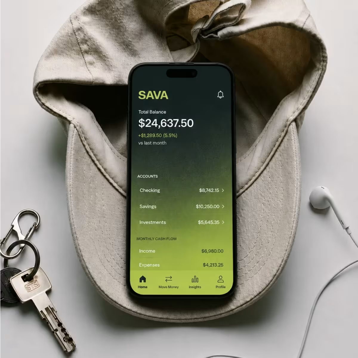
We built Sava around a balance of clarity, confidence and energy. Deep greens create a sense of stability while unexpected neon accents, gradients, grain and bold digital imagery push the brand firmly out of traditional finance territory.
The result is a money management brand that feels credible without feeling corporate — making a traditionally serious category feel more accessible, contemporary and built for the way people manage money today.

Client
Sava Money Management
Date
2025
Service
Sava Money Management