Overview
BEFORE
Sage Pilates struggled to keep its branding consistent. Too many colors and fonts left everything feeling disconnected, and the existing brand kit was difficult to stick to. They wanted something simple, functional, and elegant, with a modern feel.
AFTER
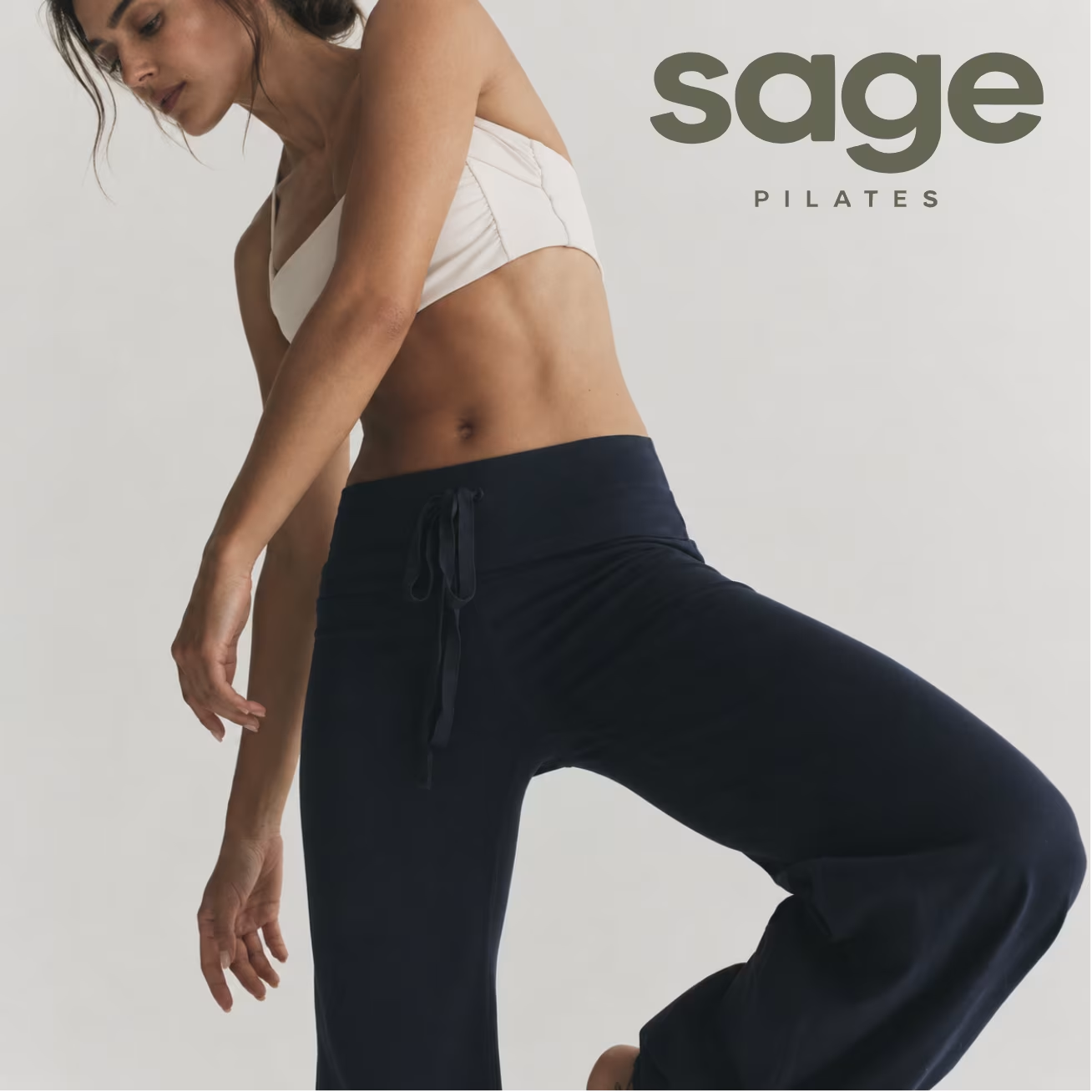
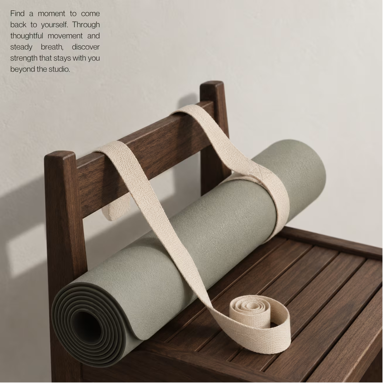
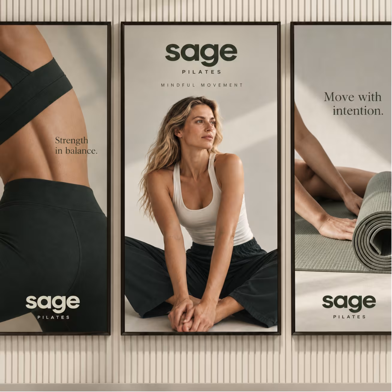
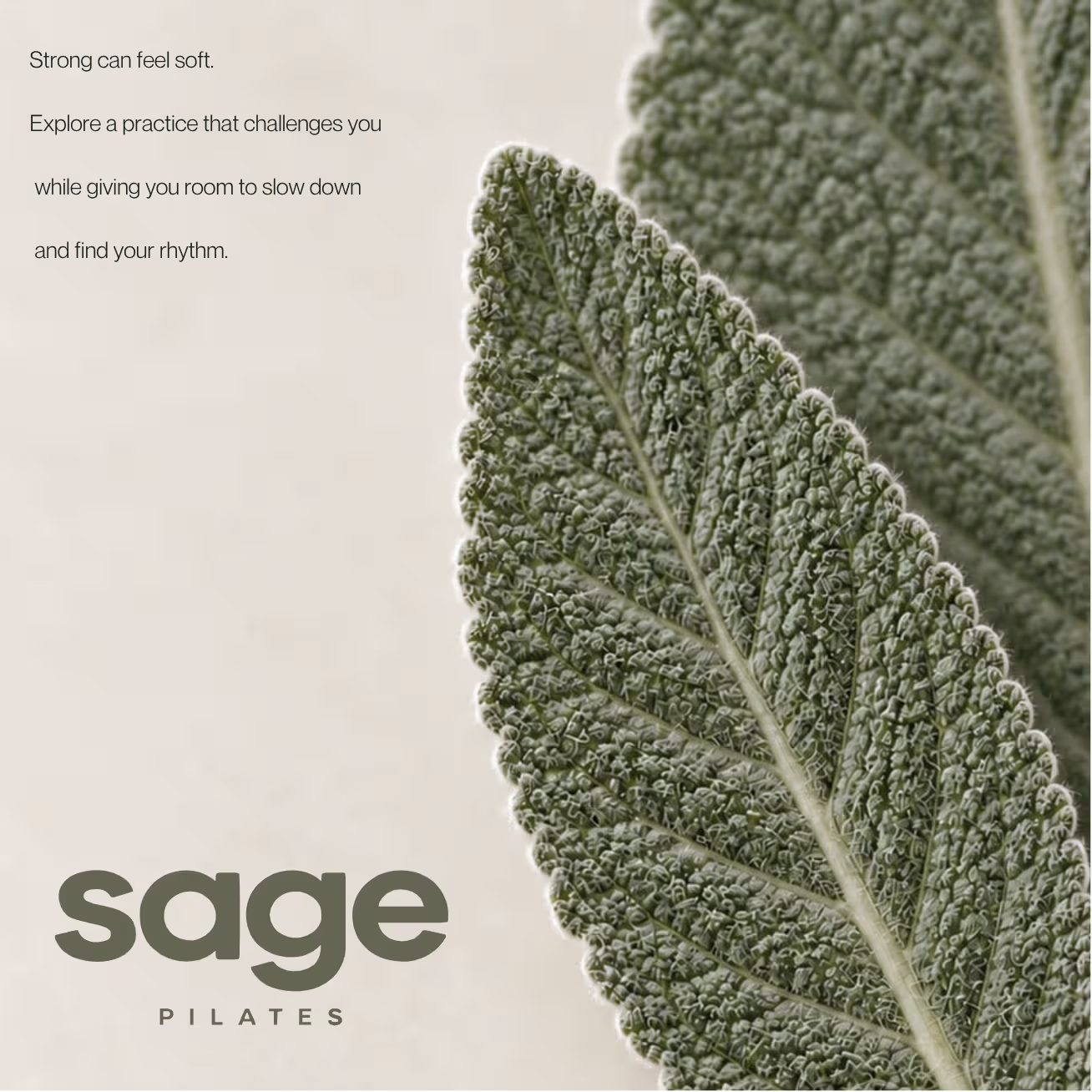
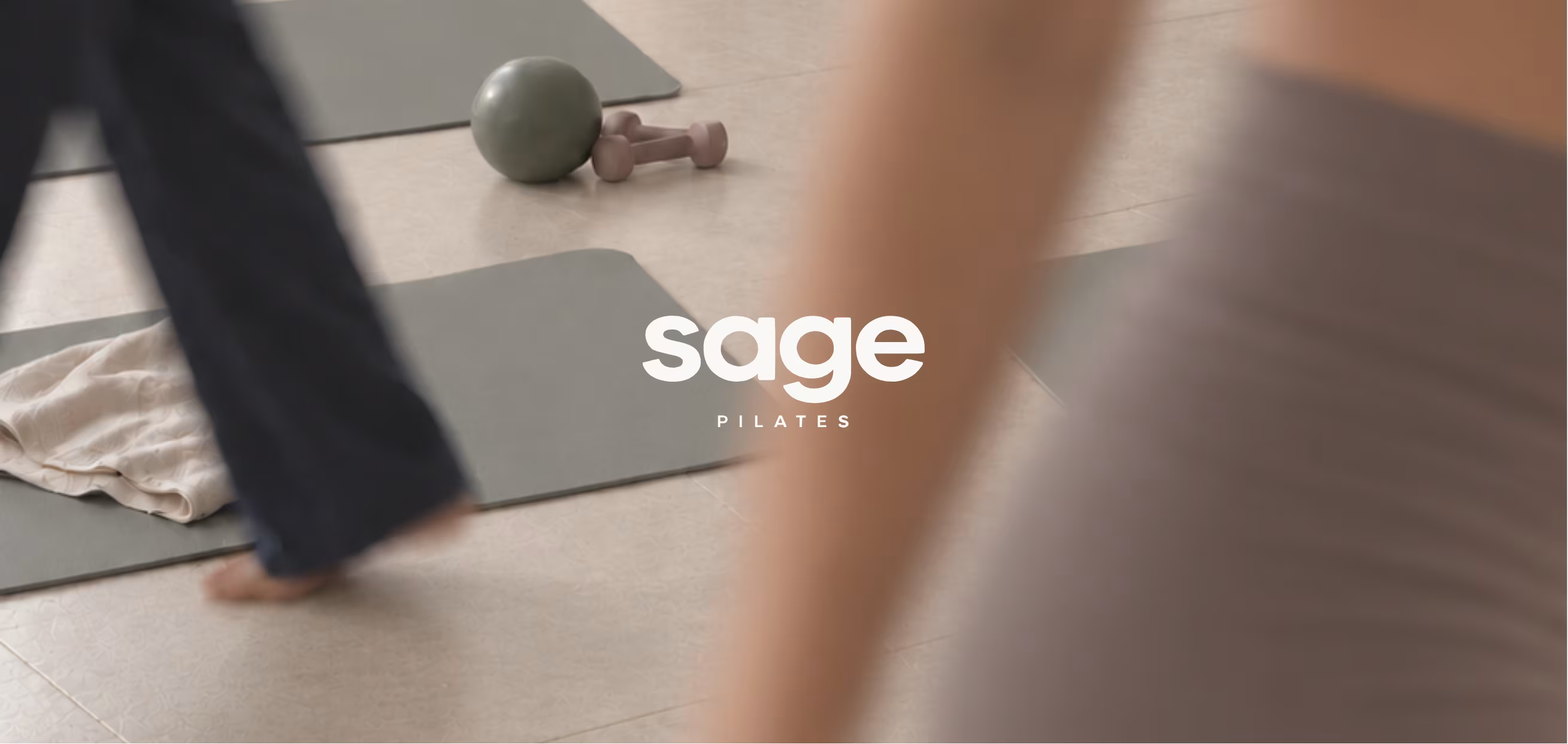
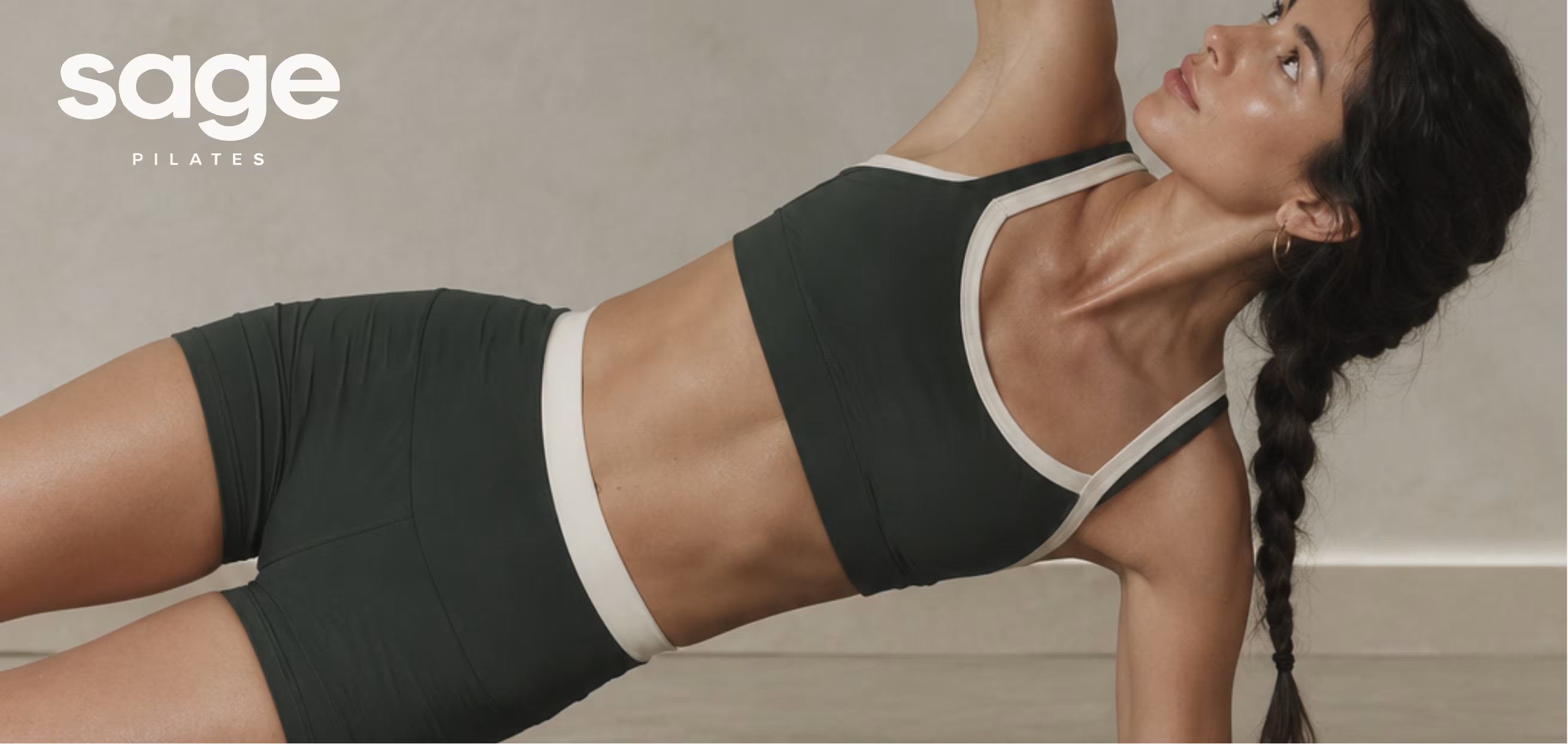
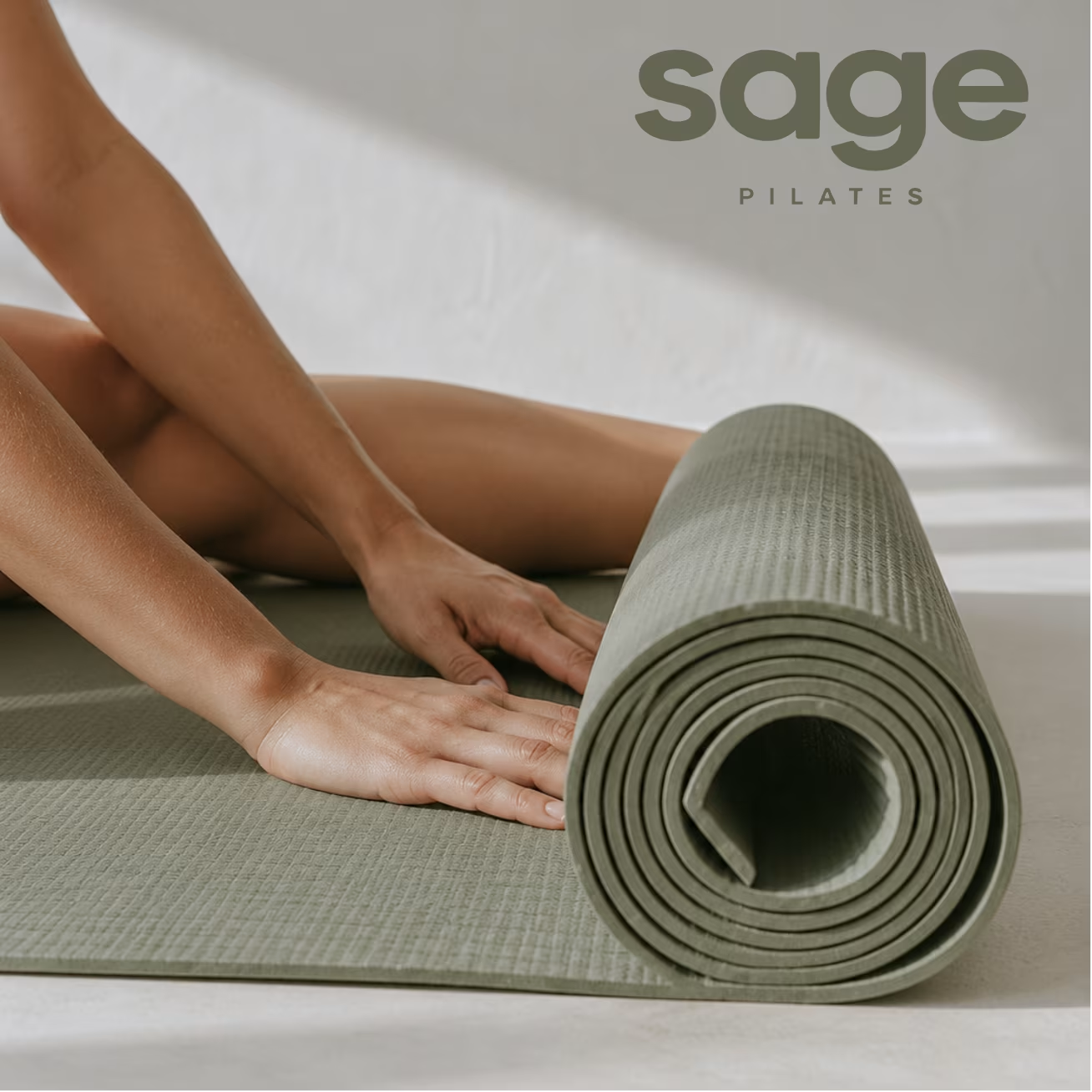
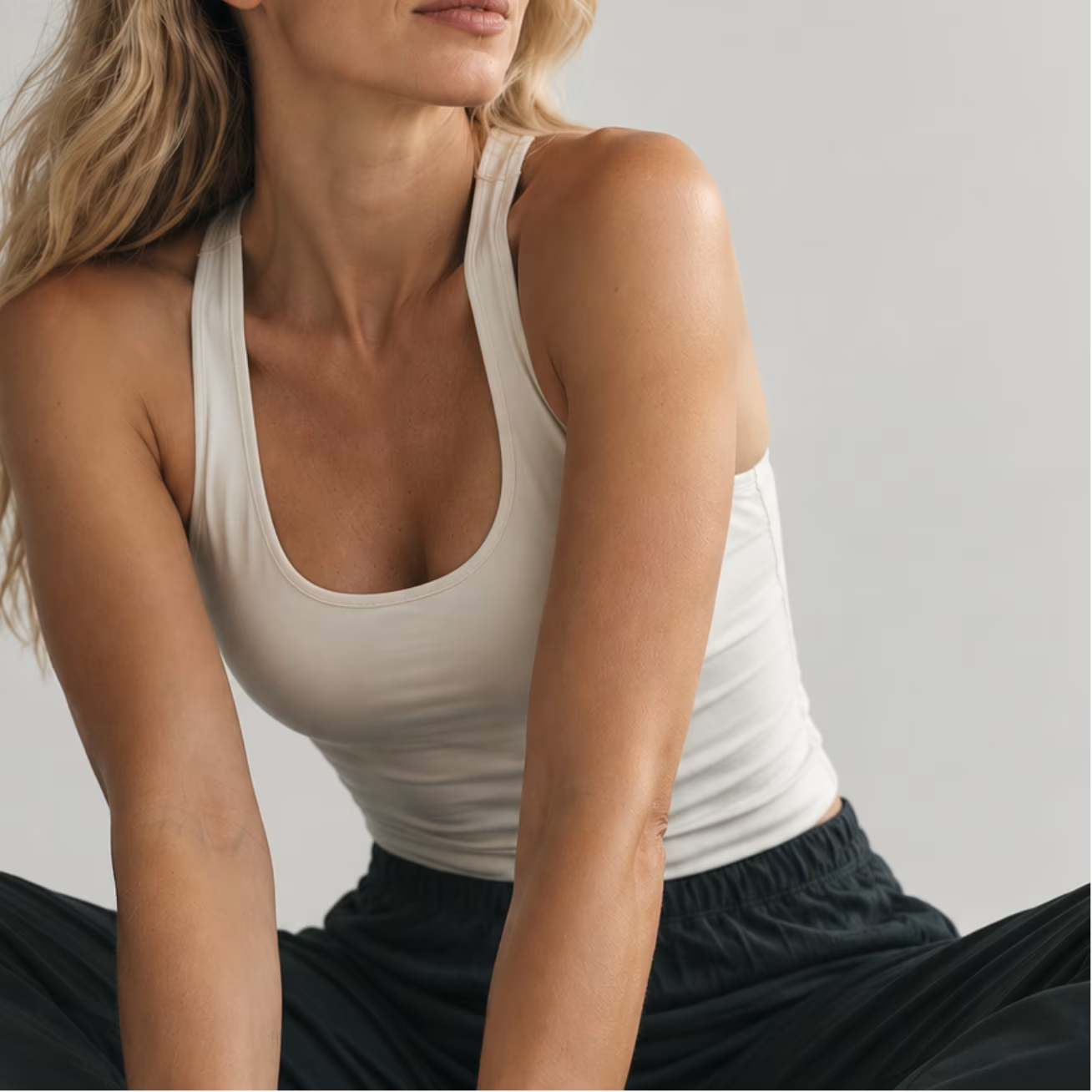
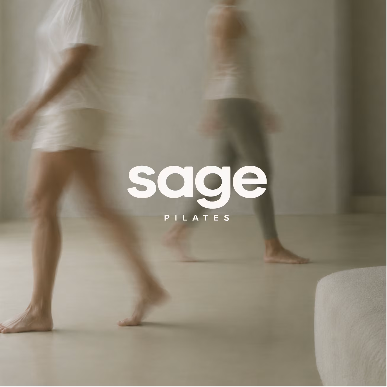
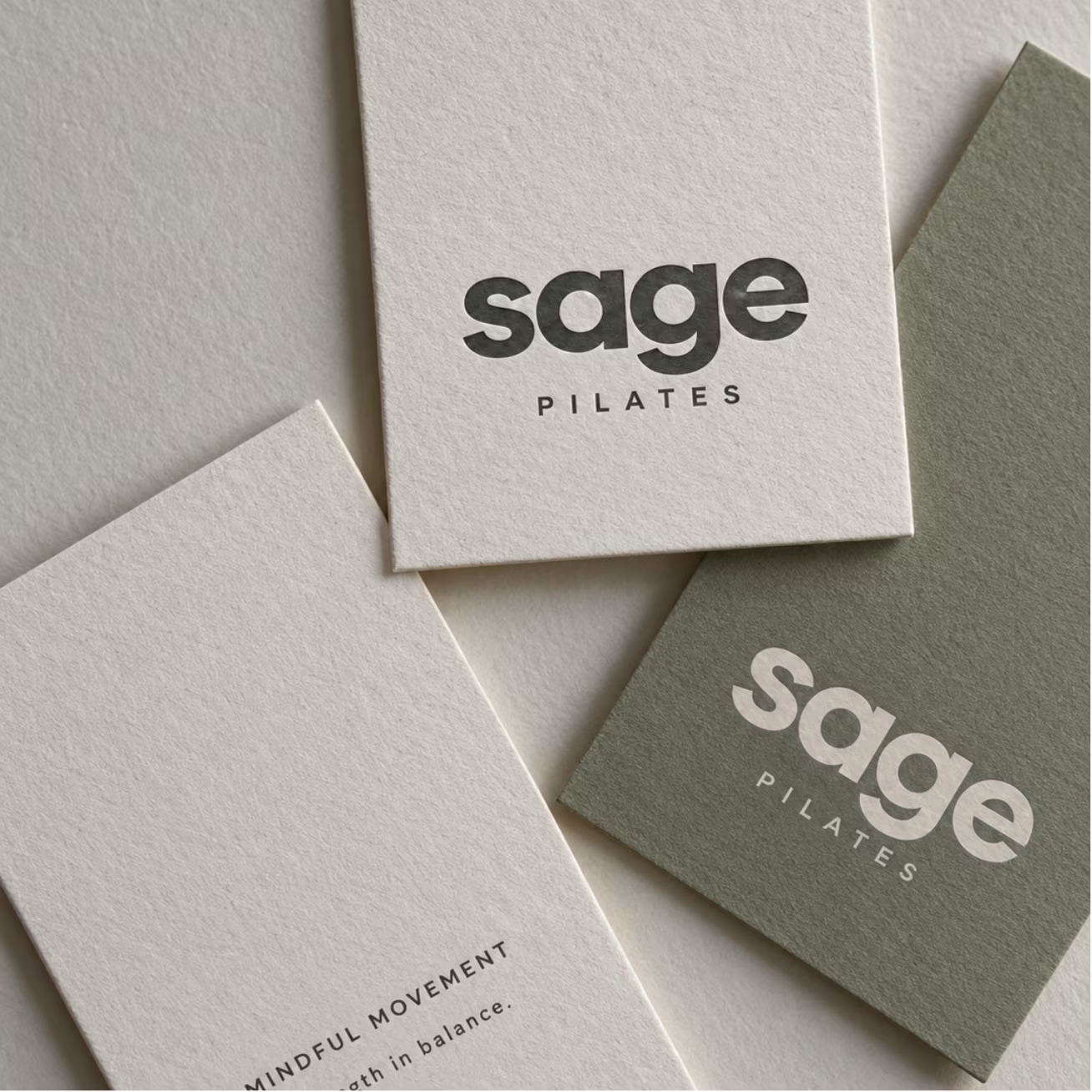
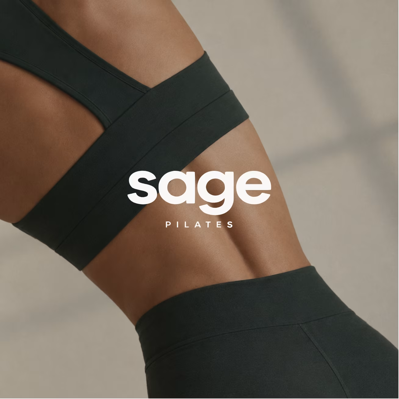
We gave Sage a clear, cohesive identity built around confident typography, a refined earthy palette, and natural editorial photography. The result feels grounded and welcoming, balancing the softness of mindful movement with the strength of Pilates.
A simplified set of brand elements makes it easier to create consistent materials across social media, print, and the studio itself—giving Sage a distinctive look that’s practical to use every day.

Client
Sage Pilates
Date
2026
Service
Branding